
Choosing a name and designing a logo to a business is not always an easy thing: a lot of factor has to be considered according to the target market, industry, countries of operations, etc.
All that can be resumed in a single question: what is the message you want to transmit?
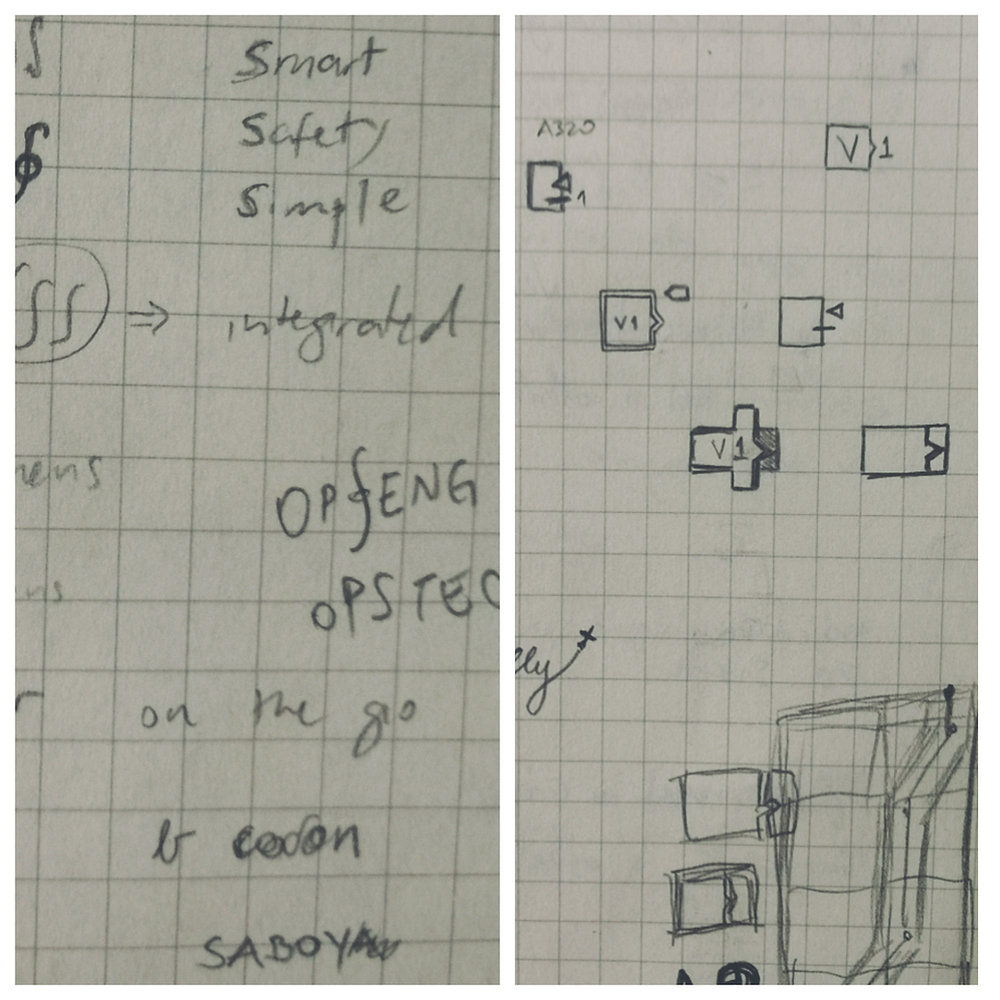
With that in mind, our challenge was how to show to a traditional industry as aviation is, that this new company would praise for innovation and technology, but not neglecting safety aspects.
Moreover, our name and logo choices should communicate our values, represented by our 4 pillars:
Full support, for a stress free operation, with no hidden lines
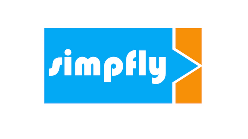
After brainstorming different name options, we decided for the one we considered the most elegant one: Simpfly. It delivers the message we were looking for, which is to simplify operators processes and reduce costs and pilot workload, so they can focus simply on flying, while we take care of the back-office tasks.
The color selection for the logo was crucial to transmit the idea of safety walking together with innovation: the blue represents this serenity of blue skies, while the orange represents the new and disruptive.
Finally, the logo design was thought on indicating that:
we are on aviation business
And that was achieved by the stylized airspeed/altitude indicator and target of a PFD Primary Flight Display):